Background
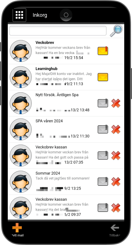
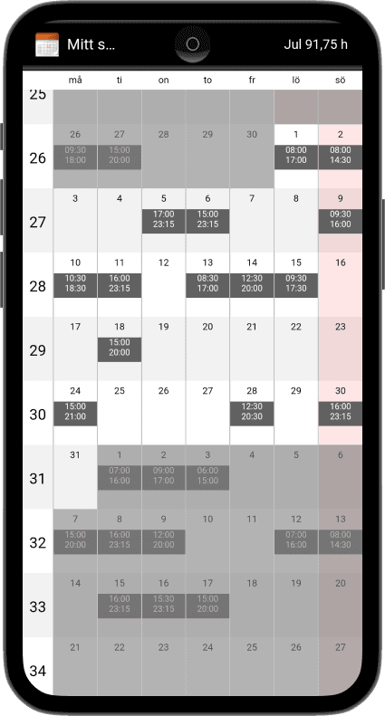
iPool 1.0 is an employee and management tool used by stores like ICA, Coop, and Willys for scheduling, payslips, and communication. After using the app at work, I found it visually outdated and hard to navigate, which inspired me to design a more intuitive and modern user experience. Since my own experience could influence my perspective, I made a conscious effort to stay as neutral as possible throughout the process.
Background
iPool 1.0 is an employee and management tool used by stores like ICA, Coop, and Willys for scheduling, payslips, and communication. After using the app at work, I found it visually outdated and hard to navigate, which inspired me to design a more intuitive and modern user experience. Since my own experience could influence my perspective, I made a conscious effort to stay as neutral as possible throughout the process.
Gathering insights through surveys and testing
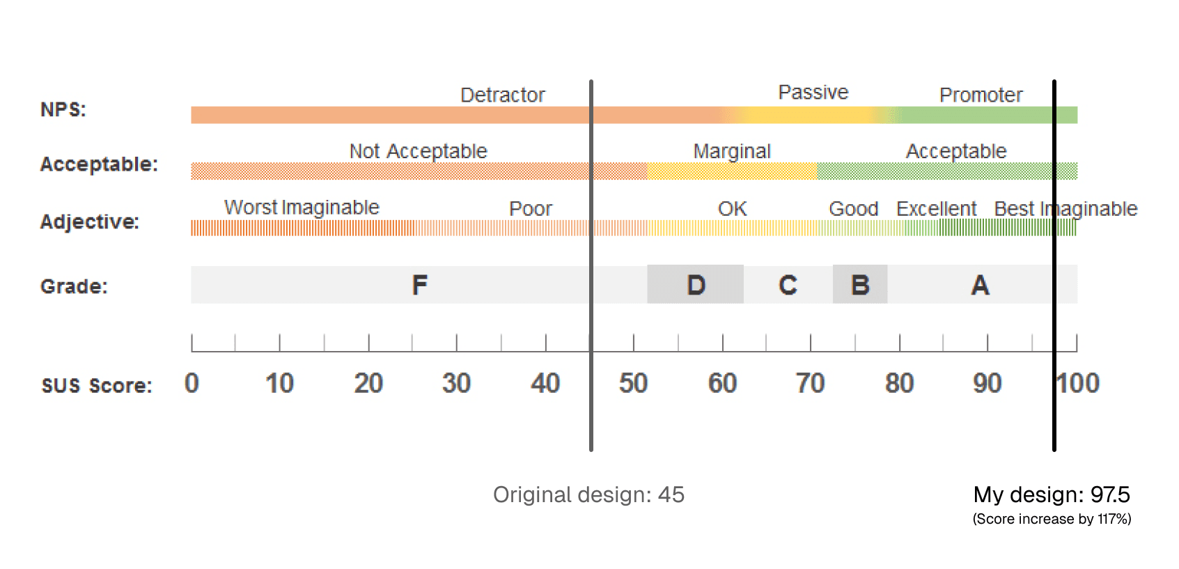
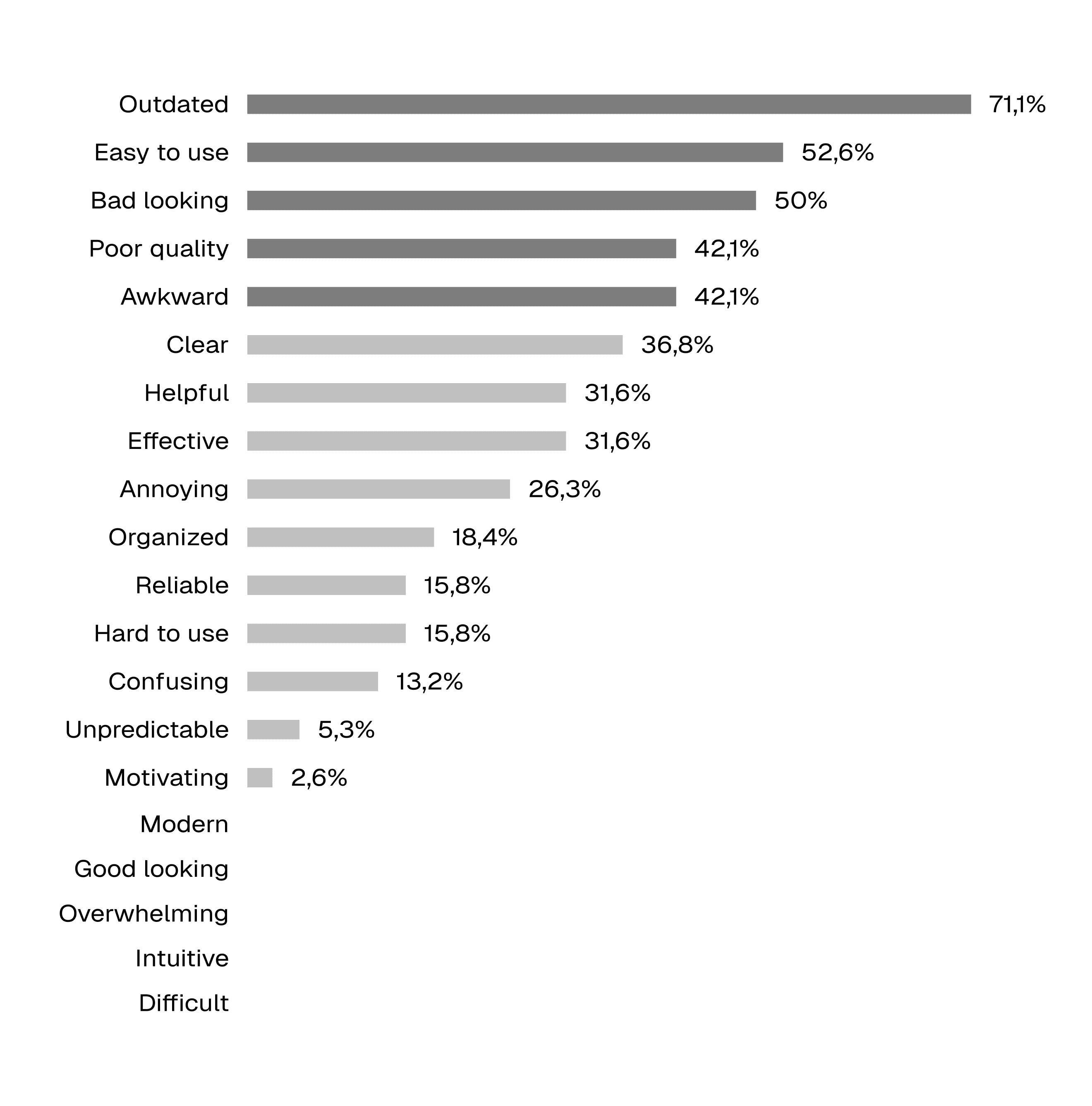
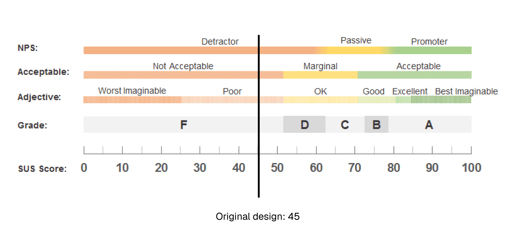
I began by sending a survey to companies that use iPool, gathering 38 responses. Participants provided feedback on usability issues and selected descriptive words from a list of Microsoft Reaction Cards. The top five descriptors were outdated, easy to use, bad looking, awkward, and poor quality. Although I planned to conduct user interviews, I couldn’t secure participants in this target group, so I shifted to usability tests with new users instead. I did a total of four Usability Tests, each person were given seven tasks to try to complete while thinking out loud. After the tests, I let the participants pick five Microsoft Reaction Cards from the same list as in the survey. They also evaluated the usability with the System Usability Scale.
Gathering insights through surveys and testing
I began by sending a survey to companies that use iPool, gathering 38 responses. Participants provided feedback on usability issues and selected descriptive words from a list of Microsoft Reaction Cards. The top five descriptors were outdated, easy to use, bad looking, awkward, and poor quality. Although I planned to conduct user interviews, I couldn’t secure participants in this target group, so I shifted to usability tests with new users instead. I did a total of four Usability Tests, each person were given seven tasks to try to complete while thinking out loud. After the tests, I let the participants pick five Microsoft Reaction Cards from the same list as in the survey. They also evaluated the usability with the System Usability Scale.
Confusing navigation
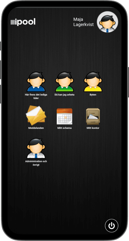
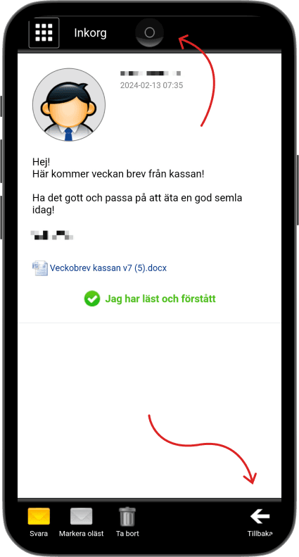
The usability tests revealed major navigation issues. Participants struggled to move back or return home. As one particiant said, “it’s really hard to go back to where I were.” While a back arrow was available, the home button was camouflaged and often overlooked, as its skeuomorphic design didn’t match users’ mental models of a home button.
Confusing navigation
The usability tests revealed major navigation issues. Participants struggled to move back or return home. As one particiant said, “it’s really hard to go back to where I were.” While a back arrow was available, the home button was camouflaged and often overlooked, as its skeuomorphic design didn’t match users’ mental models of a home button.
Sketch, test, repeat
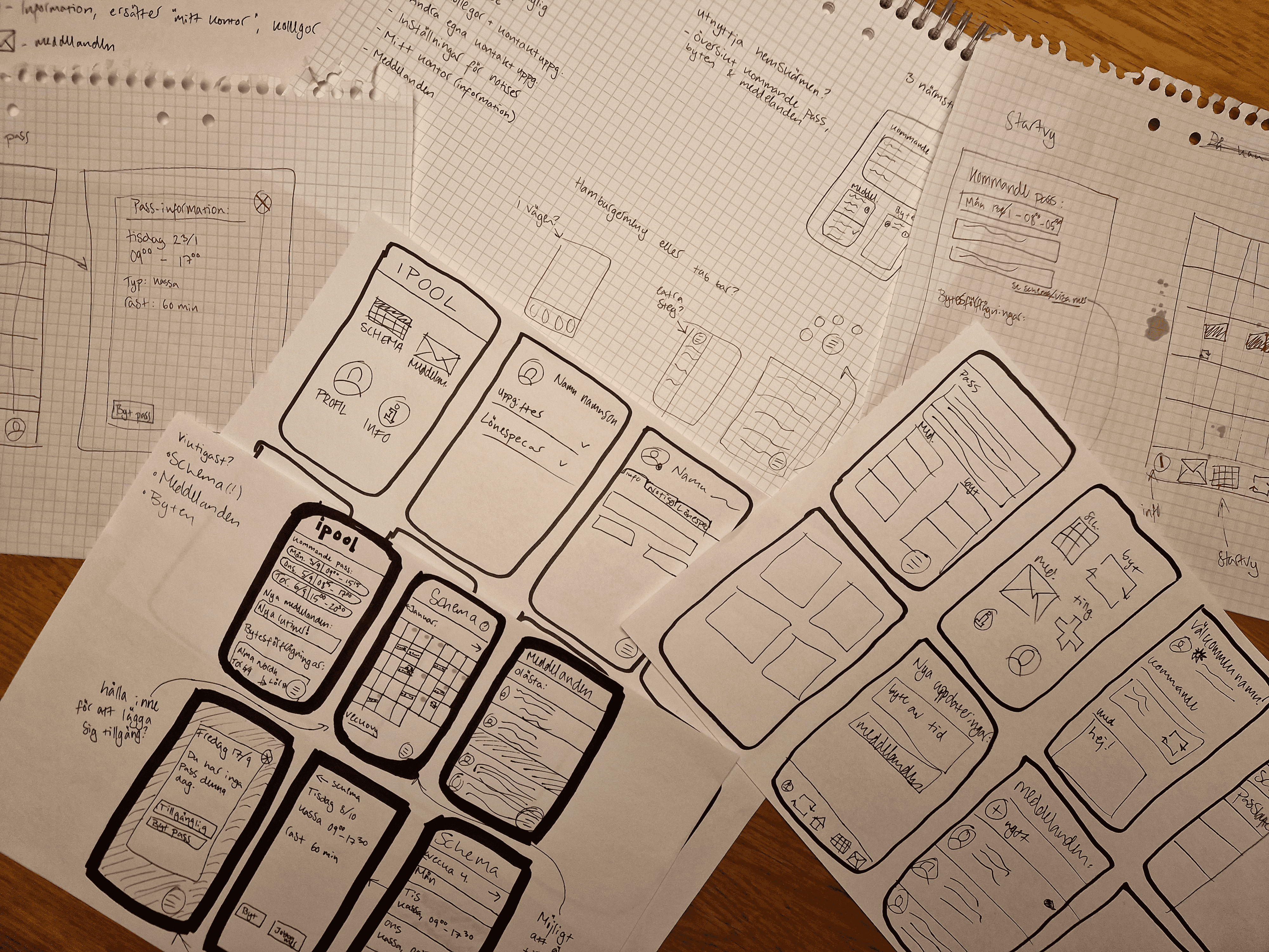
After analyzing the data, I began sketching and brainwriting to explore which features to improve, along with other ideas that came up. When I got stuck, I used the Crazy 8 method to generate new perspectives, allowing me to freely explore ideas and pick the most promising ones. Once I had a sketch I liked, I created a mid-fi prototype in Figma and tested it with new participants. The feedback was generally positive, and I incorporated necessary changes into the hi-fi prototype.
Sketch, test, repeat
After analyzing the data, I began sketching and brainwriting to explore which features to improve, along with other ideas that came up. When I got stuck, I used the Crazy 8 method to generate new perspectives, allowing me to freely explore ideas and pick the most promising ones. Once I had a sketch I liked, I created a mid-fi prototype in Figma and tested it with new participants. The feedback was generally positive, and I incorporated necessary changes into the hi-fi prototype.
Final prototype
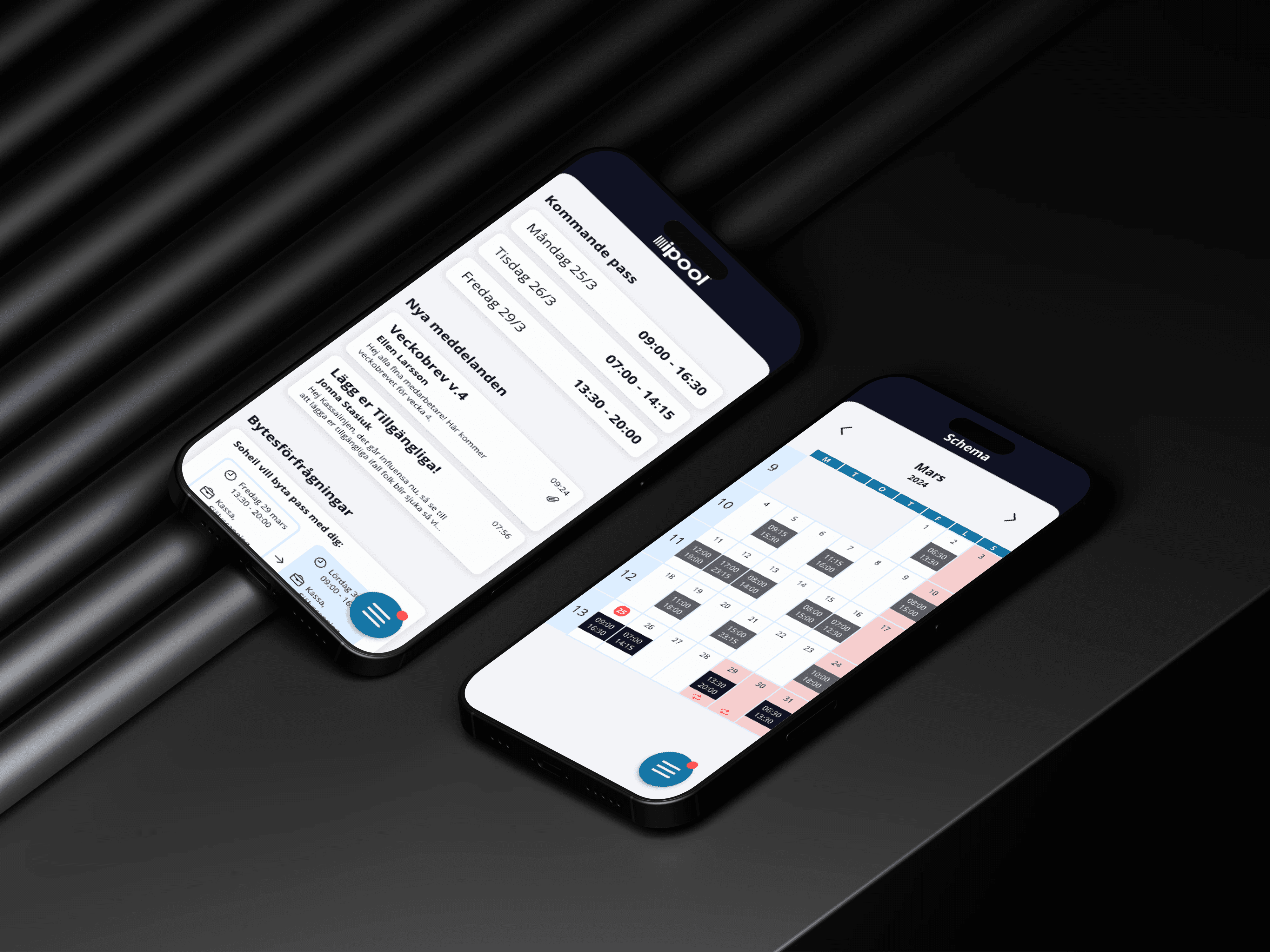
By surfacing key features on the home screen, I reduced unnecessary navigation. User testing showed that ipool is mainly used to check schedules, so the home screen now displays the user’s three upcoming shifts. Users can tap a shift to see details, as well as any new messages or shift swap requests. Navigation between pages is handled through a floating hamburger menu in the bottom right. The Schedule page remains similar to the original but now gathers all schedule-related features in one place: viewing shifts, swapping shifts with colleagues, and marking availability.
Final prototype
By surfacing key features on the home screen, I reduced unnecessary navigation. User testing showed that ipool is mainly used to check schedules, so the home screen now displays the user’s three upcoming shifts. Users can tap a shift to see details, as well as any new messages or shift swap requests. Navigation between pages is handled through a floating hamburger menu in the bottom right. The Schedule page remains similar to the original but now gathers all schedule-related features in one place: viewing shifts, swapping shifts with colleagues, and marking availability.
One last test
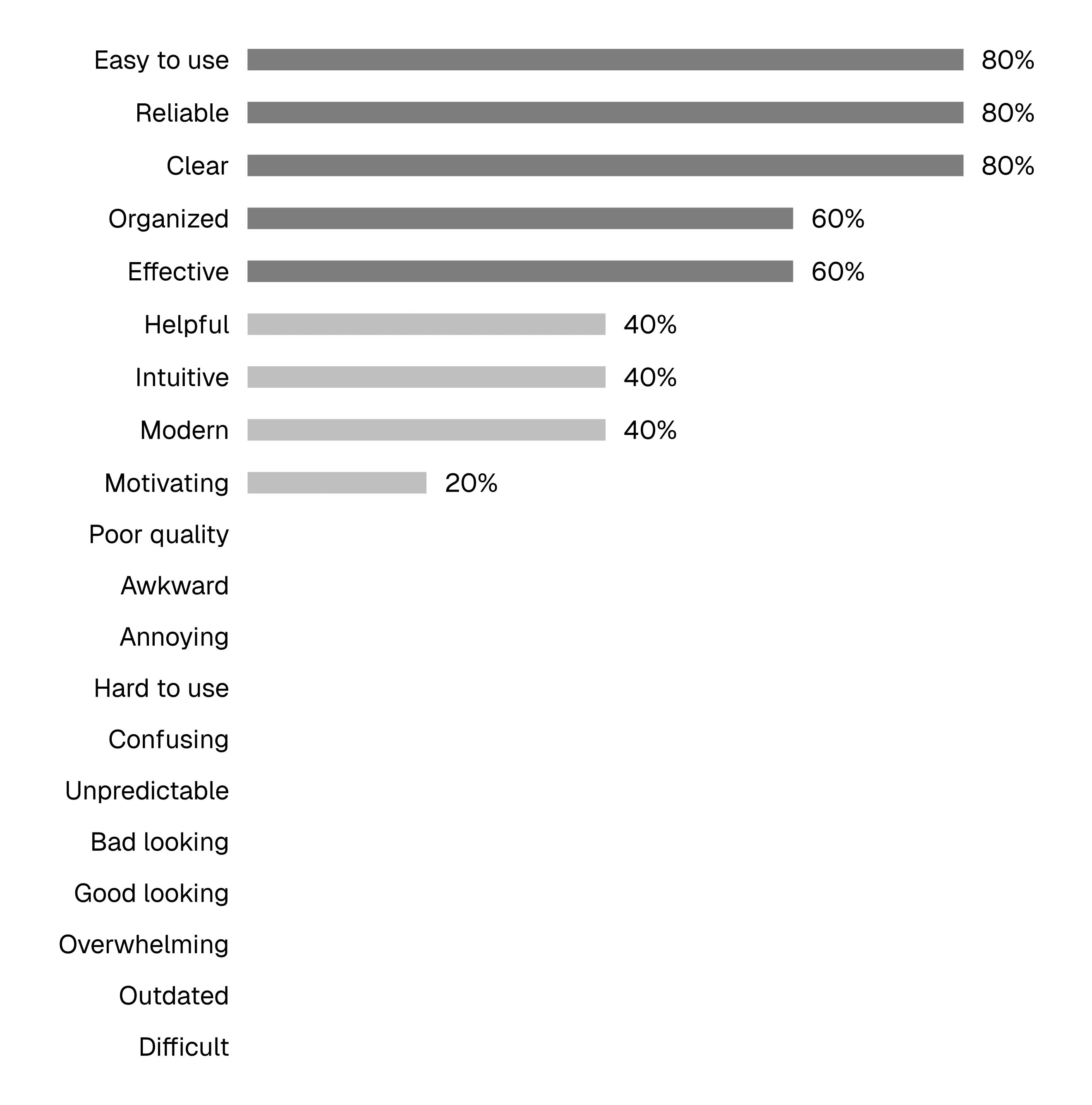
I tested the final prototype and was very pleased with the result. Two of the participants were completely new to ipool, and the other three had participated in the first test of the original ipool.