A first analysis
To get a deeper understanding of where the Espresso House app lacked in accessibility, I performed an accessibility analysis. Below are some of my key findings.
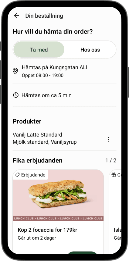
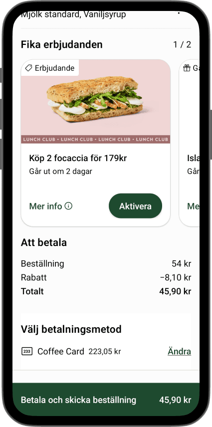
The check out screen lacks visual hierarchy and is hard to scan.
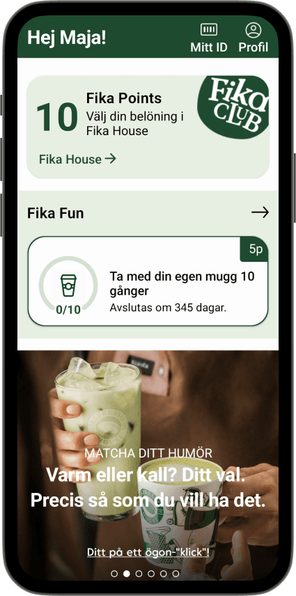
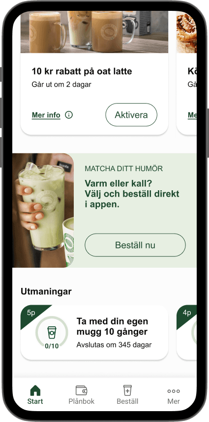
Text is frequently put on images without fulfilling contrast requirements.
Several links use vague, promotional language that does not describe their destination or outcome.
The app does not adapt to system settings such as larger text sizes or dark mode, which may affect compatibility with assistive technologies.
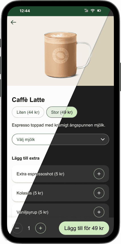
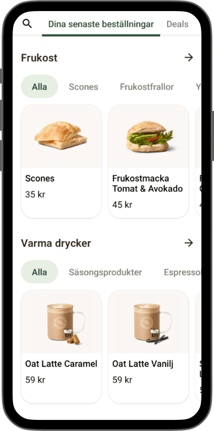
Product pricing is misleading, only the price for the smallest size coffee is shown before clicking on the product.
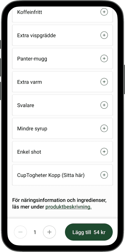
The product page gets cluttered with pills in every category.
Testing the original app
I conducted two usability tests of the Espresso House app focusing on ordering flow, information discoverability, and the loyalty system. Participants explored the home screen, placed an order with allergy requirements, and explained their understanding of “Fika Points,” while I used neutral follow-up questions to observe natural behavior.
The results revealed mixed experiences. One participant completed the tasks easily, while the other struggled to find allergy information due to unclear navigation. Both noted readability issues caused by low text contrast on images, and branded concepts such as “Fika House,” “Fika Fun,” and “Fika Club” were perceived as confusing and overwhelming.
Fixing contrast issues
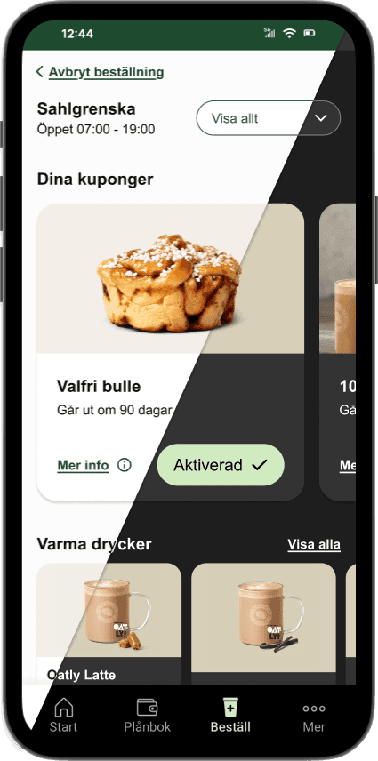
Instead of putting the text on an image, I made sure to put it on a colored block to control the contrast.
Additionally, I clarified that the CTA button leads the user to the ordering site, instead of having a vague marketing message.
Before: Poor readability depending on image
Clarify allergens
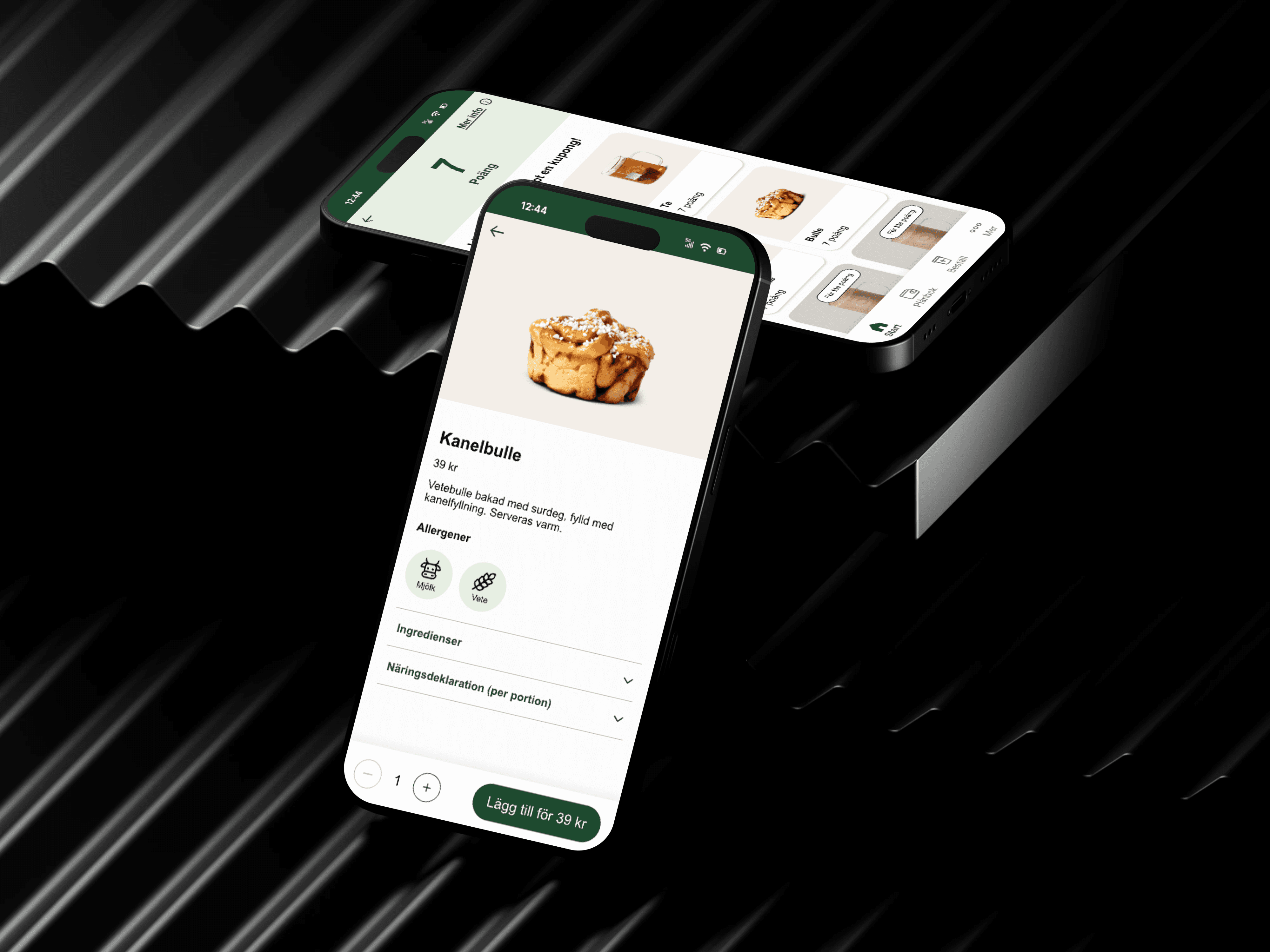
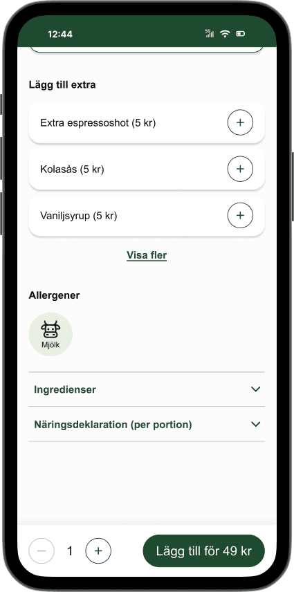
Around 15% of Sweden's population has some kind of food allergy. During my iniatial user testing, most of the participants found it hard and confusing to find information about food content and allergens.
In my design, I added a symbol and text to represent the 14 allergens stated by EU. I also added foldable ingredient lists and nutritional information about the products to increase trust.
Added dark mode
Since the app did not support dark mode, I added it to my design.